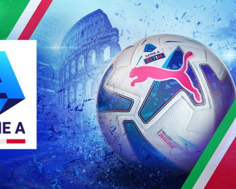
The 123rd edition of Italy’s Serie A has finally begun, and that can only mean one thing – kit rankings! Dive in to see who wins this season’s style scudetto, and who should be relegated to the back of the rack.
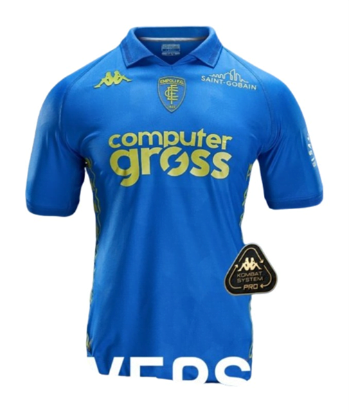
#20 EMPOLI
Gross indeed. Kappa continues to disappoint with Empoli for some reason, opting to make this absolutely sickening shade of green the only feature of this year’s kits. Perché?
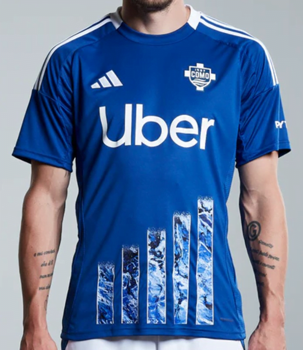
#19 COMO
What is going on here? Is the tacky “raising the bar” design supposed to signify their promotion? For such an incredibly beautiful city backed by the richest owners in Italy climbing to the summit of calcio, this shirt falls well short of the mark.
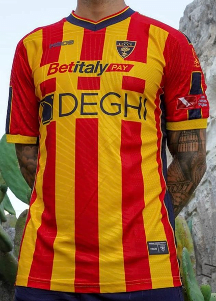
#18 LECCE
There is a lot going on here, and it kind of feels like three different jerseys crammed together in one. They could’ve at least made the sleeve cuffs the same navy blue as the collar. It’s loud and messy, but I suppose that’s what you want in a relegation contender anyway.
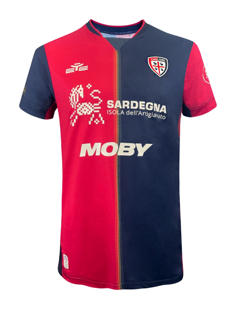
#17 CAGLIARI
The worst of the red and blue boys this year, it looks like one of those hokey stitched together “house divided” college football t-shirts.
#16 HELLAS VERONA
It’s definitely a football kit, but it just doesn’t feel very good, does it?
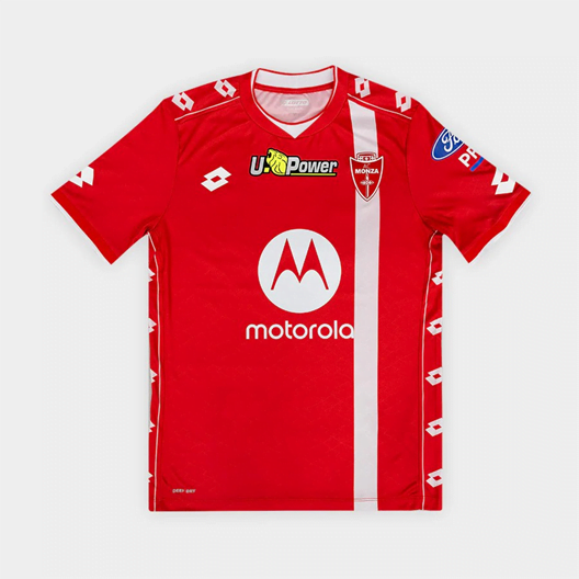
#15 MONZA
Like most of us, Monza are shocked that they are still here. They are so surprised to have survived another season in Serie A, they’ve decided to wear basically the same jerseys once again. They don’t want to mess with what they’ve got going on. Italians are superstitious, after all.
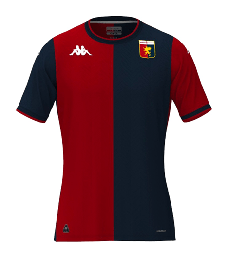
#14 GENOA
Yep, that’s definitely a Genoa kit! Pretty solid as usual, though the asymmetrical trim at the edge of the sleeve openings is jarring enough to feel like a factory error once you notice it, and once you notice it, you can’t not see it. Sort that out, and it’s beautiful.
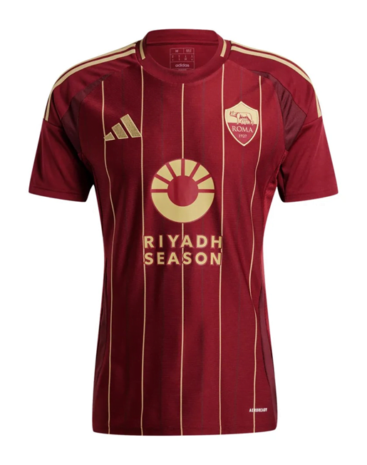
#13 ROMA
It’s not a terrible front half of a jersey in isolation, but it feels almost offensively uninspired given Roma’s rich history of stunning kits. The consistent two-tone effect uniting the badge and the rest of the shirt is nice enough, but there’s not much else to say about putting pinstripes on the front and calling it a day.
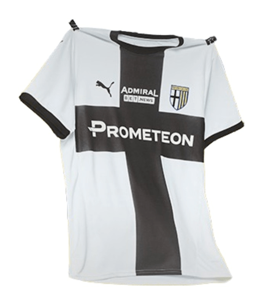
#12 PARMA
Long before Venezia became the darlings of the football fashion world, Parma had a long and illustrious career as one of the most stylish clubs in the world. Unfortunately, Puma doesn’t quite rise to the occasion of I Crociati’s return to the summit of calcio, with an okay-not-great release that just meets but in no way exceeds the brief.
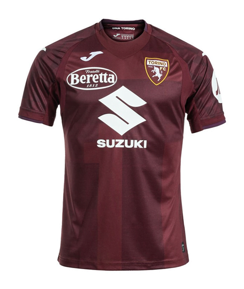
#11 TORINO
Supposedly it’s inspired by the architecture of Torino’s famous Mole Antonelliana, but I’m not seeing it. I miss the giant bull, who we used to see like clockwork every other season but hasn’t appeared in a while now. I wonder where he is. I hope he’s okay.
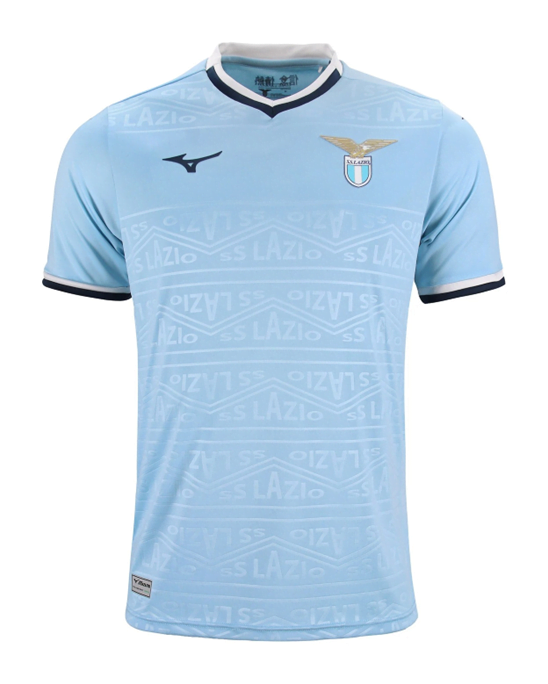
#10 LAZIO
It’s not bad, but the repetitive sameness is starting to get a bit dull, as each Mizuno effort feels like a slightly less good version of the template that came before. We know Lazio is capable of bold eagles, punchier patterns, or at the very least, that historic band.
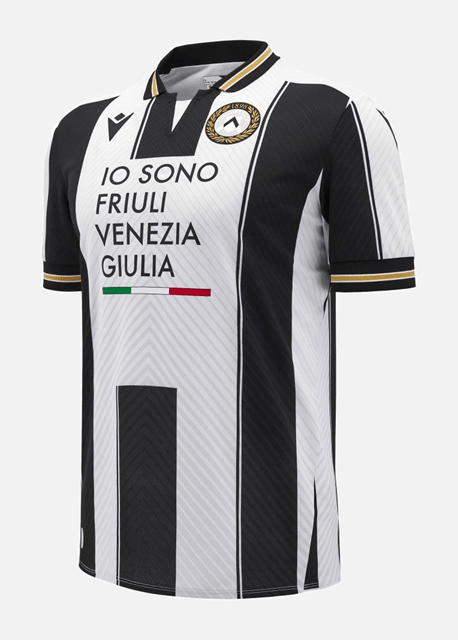
#9 UDINESE
This kit’s actually pretty cool, but it’s distractingly marred by an overbearing shirt sponsor. I don’t think shirt sponsors are supposed to have that many words in them. Why is it so many words?
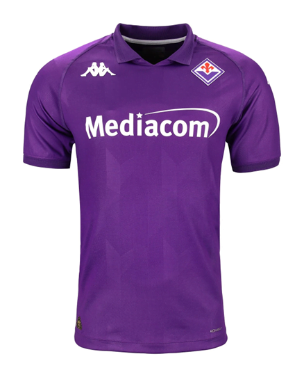
#8 FIORENTINA
Though simple, it’s subtly pleasing how the shape of the collar matches the angularity of the badge and the faint geometry of the watermarks. More importantly, Fiorentina have placed an emotional touch at the back of the neck: 13 lilies – 12 in white to represent the players on the pitch and the fans, and a 13th in red to honor their late captain, Davide Astori.
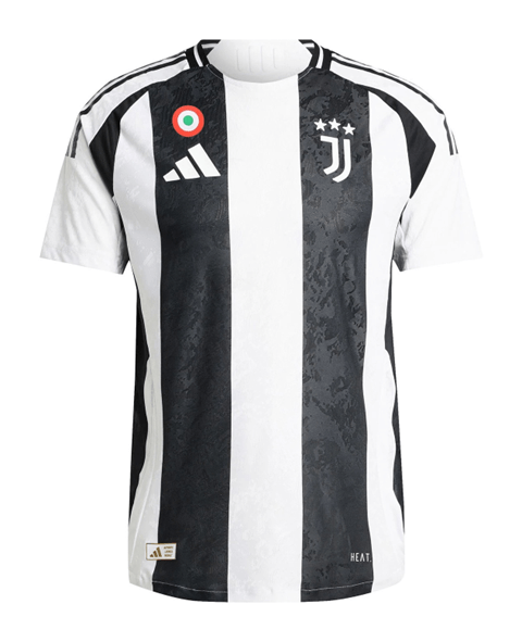
#7 JUVENTUS
With a texturing meant to evoke the lunar surface, Juve are hoping this jersey sees the Old Lady shoot for the moon once again. Though the coccarda may be better served in the center of the kit, the burst of tricolore punctuates the black and white canvas nicely while we wait to see who the shirt sponsor will be (if there ever is one). If nothing else, it’s certainly better than the overdone chaos from the last few years, even if the back still looks like a plain white tee.
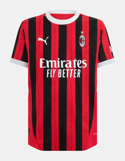
#6 MILAN
Their best effort in years, Puma bring Milan back to the smart white-bordered beauty the club showcased memorably in 2011/12. Unfortunately, the name and number float aimlessly on a disjointed blank back half instead of locked in over continuous stripes as they did before, ruining what would’ve otherwise been cohesive perfection.
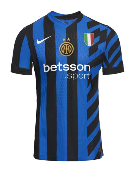
#5 INTER
Whether you think it’s deserved or not, Inter really wants you to see their 2nd star, and they’ve pushed the scudetto patch out wide so their club badge can demand full attention front and center. It looks more like a fan-made concept kit than an official jersey, but I have to admit, the riskiness of the design pays off. The fact that this shirt continues its stripes all the way around, placing the namesets on top instead of in an empty box, sends it ahead of the Nerazzurri’s immediate rivals.
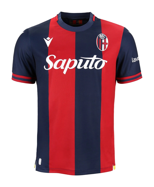
#4 BOLOGNA
Another beauty from a club in real ascension. Last year’s perfect jersey got them into Europe, and they’ll be proud to press their first Champions League sleeve patches on this smart, simple, and balanced shirt.
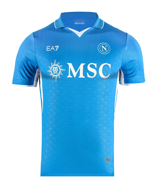
#3 NAPOLI
The worst title defense in Italian history may have drained all the tricolore from their previous strip, but the sky blue and white only result is really quite nice. Napoli may be paling in more ways than one, but one can’t deny the pleasantness of this shirt (at least until they plaster Maradona’s face on it).

#2 VENEZIA
When I first heard that the one and only Venezia was trading Kappa for Drake after gaining promotion back to Serie A, it sounded like the biggest downgrade since Twitter was turned into X. It felt highly unlikely that Nocta could produce anything better than the blank placeholders being used in the meantime – even they had real aura! But to be fair, their debut kit, still officially unreleased at the time of writing, is one of the better ones we’ll see this season, with its bold black body electrified with gold accents and that uniquely Venetian orange/green detail. Even Cynar, the underrated Italian apéritif made from artichokes, could potentially be a lowkey iconic shirt sponsor.
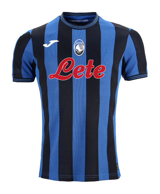
#1 ATALANTA
Simply gorgeous. Every year Atalanta shows us how it’s done, and with a jersey that feels simultaneously vintage and modern, this season is no exception. The subtle texturing in the blue stripes, the red shock of the sponsor punctuating the harmonious dichromacy, the centered oval of the Greek heroine’s silhouette… *Chef’s kiss*
—

HONORABLE MENTION – TRIESTINA
Probably the best shirt in Italy is down in Serie B, as Kappa continue to save the sauce for smaller clubs. Now THAT is a football kit.
—
